Hello Guys,
Today I want to tell you about the hack for floating labels. It is very important for designing purpose.
Today I want to tell you about the hack for floating labels. It is very important for designing purpose.

You are ready to begin, so we start with a BorderlessEntry, and if you do not know about this, please read the BorderlessEntry Blog or Article and watch the Video, I have mentioned the URL below.
- For Introduction of Custom Renderer.
- For youtube video BorderlessEntry.
- For an article of BorderlessEntry.
Okay,
So we continue with this BorderlessEntry and now we are using BindableProperty and some animation code for the float the label.
Implementation:-
- Go to the PCL project and right-click on the project.
- Then, create a new folder which is named Custom View.
- In this folder, I have to create a content view, we need to do this, which is named "FloatingEntryView.xaml".
- After creating "FloatingEntryView.xaml" we will prepare a view on "FloatingEntryView.xaml" for a custom floating label in Xamarin.Forms.
XAML CODE=> FloatingEntry.xaml
<ContentView.Content>
<Grid ColumnSpacing="16" Margin="0,8">
<Grid.RowDefinitions>
<RowDefinition Height="Auto"/>
<RowDefinition Height="1"/>
</Grid.RowDefinitions>
<Label x:Name="HiddenLabel" FontSize="10" IsVisible="False" Margin="25,15,25,10"/>
<local:CustomEntry x:Name="EntryField" Text="{Binding Text, Mode=TwoWay}" Margin="0,12,0,0"/>
<BoxView x:Name="BottomBorder" BackgroundColor="Gray" Grid.Row="1" HeightRequest="2" Margin="0" HorizontalOptions="FillAndExpand"/>
<BoxView x:Name="HiddenBottomBorder" BackgroundColor="Gray" Grid.Row="1" HeightRequest="2" Margin="0" WidthRequest="0" HorizontalOptions="Center"/>
</Grid>
</ContentView.Content>
Now we are set BorderlessEntry, hide label and the boxview in "FloatingEntryView.xaml" view. Well, I am satisfied this design part, now I'm going to write some code on "Focus" and "Focus" event and using animation to display the label when I touch any entry.
AccentColor, Text, Text Color, Placeholder and Placeholder Color.
Below I mentioned that the blah blah code ….. :)
C# Code FloatingEntry.cs
using System.Threading.Tasks;
using Xamarin.Forms;
using Xamarin.Forms.Xaml;

namespace XamBuddyApp.CustomControls.CustomView
{
[XamlCompilation(XamlCompilationOptions.Compile)]
public partial class FloatingEntry : ContentView
{
public FloatingEntry()
{
InitializeComponent();
EntryField.BindingContext= this;

EntryField.Focused+= async (s, a) =>
{

HiddenBottomBorder.BackgroundColor= AccentColor;
EntryField.TextColor= HiddenLabel.TextColor = AccentColor;
HiddenLabel.IsVisible= true;

if(string.IsNullOrEmpty(EntryField.Text))
{
//Here we give animation on label position, label fading and box view.
await Task.WhenAll(
HiddenBottomBorder.LayoutTo(new Rectangle(BottomBorder.X, BottomBorder.Y, BottomBorder.Width,BottomBorder.Height + 2), 200),
HiddenLabel.FadeTo(1,120),
HiddenLabel.TranslateTo(HiddenLabel.TranslationX- 25, EntryField.Y - EntryField.Height , 200, Easing.BounceIn)
);
EntryField.Placeholder= null;
}
else
{
await HiddenBottomBorder.LayoutTo(new Rectangle(BottomBorder.X, BottomBorder.Y,BottomBorder.Width, BottomBorder.Height), 200);
}
};
EntryField.Unfocused+= async (s, a) =>
{
if(string.IsNullOrEmpty(EntryField.Text))
{
await Task.WhenAll(
HiddenBottomBorder.LayoutTo(new Rectangle(BottomBorder.X, BottomBorder.Y, 0, BottomBorder.Height + 2), 200),
HiddenLabel.FadeTo(0,180),
HiddenLabel.TranslateTo(HiddenLabel.TranslationX+ 25, EntryField.Y, 50, Easing.BounceIn)
);
EntryField.Placeholder= Placeholder;
}
else
{
await HiddenBottomBorder.LayoutTo(new Rectangle(BottomBorder.X, BottomBorder.Y, 0,BottomBorder.Height), 100);
}
};
}

public static BindableProperty TextProperty = BindableProperty.Create(nameof(Text),typeof(string), typeof(FloatingEntry), defaultBindingMode: BindingMode.TwoWay);

public static BindableProperty PlaceholderProperty =BindableProperty.Create(nameof(Placeholder),typeof(string),typeof(FloatingEntry), defaultBindingMode:BindingMode.TwoWay,
propertyChanged:(bindable, oldVal, newval) =>
{
var matEntry = (FloatingEntry)bindable;
matEntry.EntryField.Placeholder= (string)newval;
matEntry.HiddenLabel.Text= (string)newval;
});

public static BindableProperty IsPasswordProperty =BindableProperty.Create(nameof(IsPassword), typeof(bool),typeof(FloatingEntry), defaultValue: false,
propertyChanged: (bindable, oldVal,newVal) =>
{
var matEntry = (FloatingEntry)bindable;
matEntry.EntryField.IsPassword= (bool)newVal;
});

public static BindableProperty KeyboardProperty =BindableProperty.Create(nameof(Keyboard), typeof(Keyboard),typeof(FloatingEntry), defaultValue: Keyboard.Default,
propertyChanged:(bindable, oldVal, newVal) =>
{
var matEntry = (FloatingEntry)bindable;
matEntry.EntryField.Keyboard= (Keyboard)newVal;
});

public static BindableProperty AccentColorProperty =BindableProperty.Create(nameof(AccentColor),typeof(Color),typeof(FloatingEntry),defaultValue:Color.Accent);

public Color AccentColor
{
get=>(Color)GetValue(AccentColorProperty);
set=> SetValue(AccentColorProperty, value);
}

public Keyboard Keyboard
{
get=>(Keyboard)GetValue(KeyboardProperty);
set=> SetValue(KeyboardProperty, value);
}

public bool IsPassword
{
get=>(bool)GetValue(IsPasswordProperty);
set=> SetValue(IsPasswordProperty, value);
}

public string Text
{
get=>(string)GetValue(TextProperty);
set=> SetValue(TextProperty, value);
}

public string Placeholder
{
get=>(string)GetValue(PlaceholderProperty);
set=> SetValue(PlaceholderProperty, value);
}
}
}
In the code, we giving some animation effects so that the effect of the float can be seen as the original widget of Android.
Finally, Code is Complete,
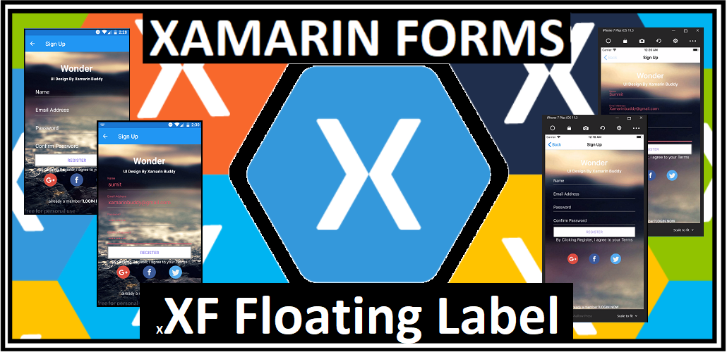
Here I am creating a login form on the MainPage.xml so I will be showing the effect of the floating label.
So let's see floating label does works properly like an android widget?
XAML CODE=> MainPage.xaml
Finally, Code is Complete,
Here I am creating a login form on the MainPage.xml so I will be showing the effect of the floating label.
So let's see floating label does works properly like an android widget?
<ContentPage.Content>
        <Grid Padding="35"  BackgroundColor="#9688EE">
            <Grid.RowDefinitions>
                <RowDefinition Height="Auto"/>
                <RowDefinition Height="Auto"/>
                <RowDefinition Height="Auto"/>
                <RowDefinition Height="Auto"/>
                <RowDefinition Height="*"/>
            </Grid.RowDefinitions>
            <StackLayout HorizontalOptions="CenterAndExpand" Grid.Row="0" Grid.Column="0">
                <Label Text="Wonder" TextColor="White" FontSize="32" FontAttributes="Bold" HorizontalOptions="Center"/>
                <Label Text="UI Design By Xamarin Buddy" TextColor="White" Font="18,Bold"/>
                <StackLayout Spacing="0" Orientation="Horizontal" HorizontalOptions="CenterAndExpand" >
                    <Label Text="Facebook" TextColor="White"/>
                    <Label Text="Twitter" TextColor="White"/>
                </StackLayout>
            </StackLayout>
            <cv:FloatingEntry Placeholder="Email" AccentColor="White" Grid.Row="1" Grid.Column="0" />
            <cv:FloatingEntry Placeholder="Password" IsPassword="True" AccentColor="White" Grid.Row="2" Grid.Column="0"/>
            <Label Text="Forgot Password?" TextColor="White" Grid.Row="3" Grid.Column="0" Margin="0,-15,0,0"/>
            <StackLayout Spacing="25" Padding="10" Grid.Row="4" Grid.Column="0" VerticalOptions="EndAndExpand">
                <Button Text="Login"  BackgroundColor="White" TextColor="#9688EE" BorderRadius="5" HeightRequest="45"
                    BorderWidth="3" BorderColor="Gray"/>
                <Label Text="Register Now" HorizontalOptions="CenterAndExpand"  TextColor="White" />
            </StackLayout>
        </Grid>
    </ContentPage.Content>
TADDDAAAAA!!!!!!!!!!!!!!!!!!!

XF FloatingLabel is working successfully.


Where is code "CustomEntry's 'Mode=TwoWay'" ?
ReplyDelete