Monday, 16 July 2018

XF Styling With CSS


Hello friends,

        How are you, hope you all are fine. Today in this article I am telling you about the CSS in Xamarin.Forms, XAML. If you know about web designing you can easily understand. This is a feature that is easy to use and your app design will be very good with its help.


What is CSS ??
I think you know about CSS still let me tell you, CSS stands for Cascading Style Sheets CSS which describes how HTML(XAML) elements should be displayed on the screen, paper or other media. CSS saves a lot of work. It can control the layout of many web pages at once. we can use it in three ways through inline, internal and external.
Now, guys come back to xamarin.forms so here I am telling you how to use CSS on xaml.

  • Here we create a project solution whose name is xaml with CSS. Go to vs2017 and select file then choose new and select project.
  • If you want to use shortcut key, press Ctr+Shift+N.
  • Now here is appearing a dialog box and then select cross-platform give the app name then choose a path where you want to place your project.
  • Now one more dialog box appears here, choose a blank app and then select .netStenderd(PCL) then press enter.
  • Before working on CSS please make sure your xamarin forms package is updated or not CSS Styling is supported after 2.6.0 or higher this feature allow to use CSS xamarin application like in the web app.
  • And if not updated, please update to latest version.
  • Now, In this project we create a folder named Assets, you can give the name whatever you like.
  • Now here we are adding a CSS file, go to the Assets folder and then right click on the folder, select Add then click on new items.
  • Here appears a dialog box and then select the web (this option is showing on the left side) and then select CSS file. Give it a name StylingwithCSS and press enter.

Note:- Firstly we can change the Build Action EmbeddedResource, Default to set the content so, the process- In vs2017 right click on CSS file go to properties then change to build action, And

In mac xamarin studio- right click on CSS file then choose build action then hit the EmbeddedResource.


CSS Benifits

Here are some benefits of CSS in xamarin.Forms,


  • Essentially, HTML for both Web and XAML for Xamarin.Forms make both visual trees. 
  • Many Xamarin developers come from an ASP.NET background so it is good for asp developers.
  • CSS is powerful and loved by many people.
  • Developers have to reuse skills before creating web applications.
  • Compared to XAML style, CSS can be easy to learn and reduce code.
  • CSS needs to be mapped with built-in XAML styles.
  • All inline XAML markup for style can be moved to CSS files.
  • CSS style offers some unique advantages with styling inheritance.
  • CSS Web and Xamarin.Forms provide the ability to share codes of styles between apps.
  • CSS usage is another optional and developers do not complain about flexibility. 


Element Property Suport

CSS can access any styling property for XML elements. Here are some most common styling properties familiar with XAML developers


  • color
  • background-color
  • font-family
  • font-size
  • font-style
  • height
  • width
  • border-color
  • border-width
  • visibility
  • opacity
  • text-align
  • margin - left | right | top | bottom
  • padding - left | right | top | bottom


CSS selectors determine which element to be used and these asset values can be set to XAML.

Style Classes

As you can expect, you can assign a CSS class to XAML elements and define the style in your CSS file - in terms of property value disputes, the last style wins. Consider the following XML,

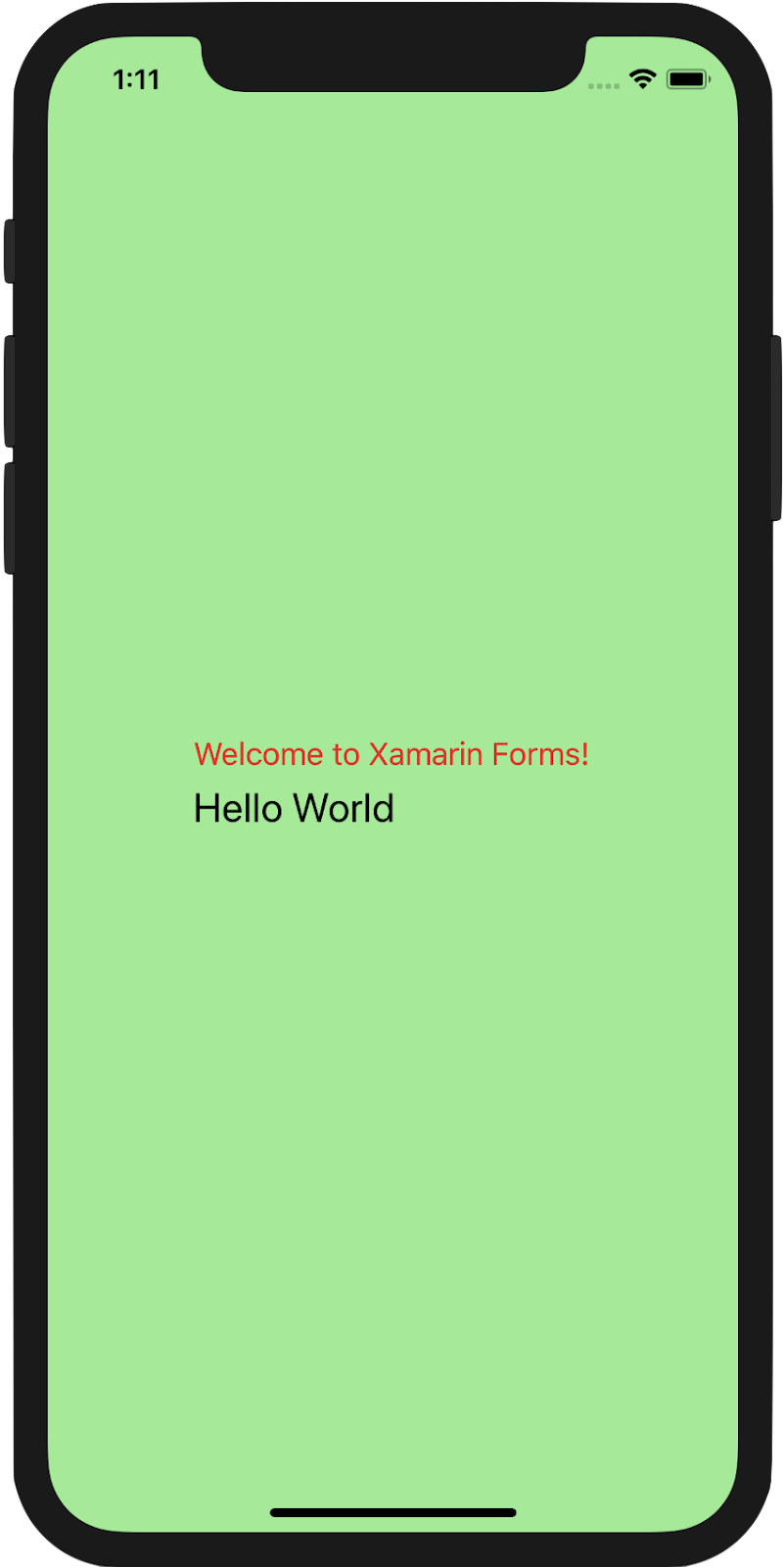
<Label Text="Welcome to Xamarin Forms!" StyleClass="MyLabel" />
XML

The Label has the .MyLabel class applied, which is as follows:

.MyLabel {
 color: red;
}
CSS
Here's how it looks at runtime


Named Styling

You can refer to any XAML visual element by their generic name as CSS selectors, but you may also fall back to x:Name to identify individual elements out of the visual tree. For example, assume the following XAML:
<Label x:Name="NamedLabel" Text="Hello World" />
XML
You can map this Label using its Name property through an ID selector in CSS:
#NamedLabel {
 font-size: large;
}
CSS
Here's how it looks at runtime:

Inline Styling

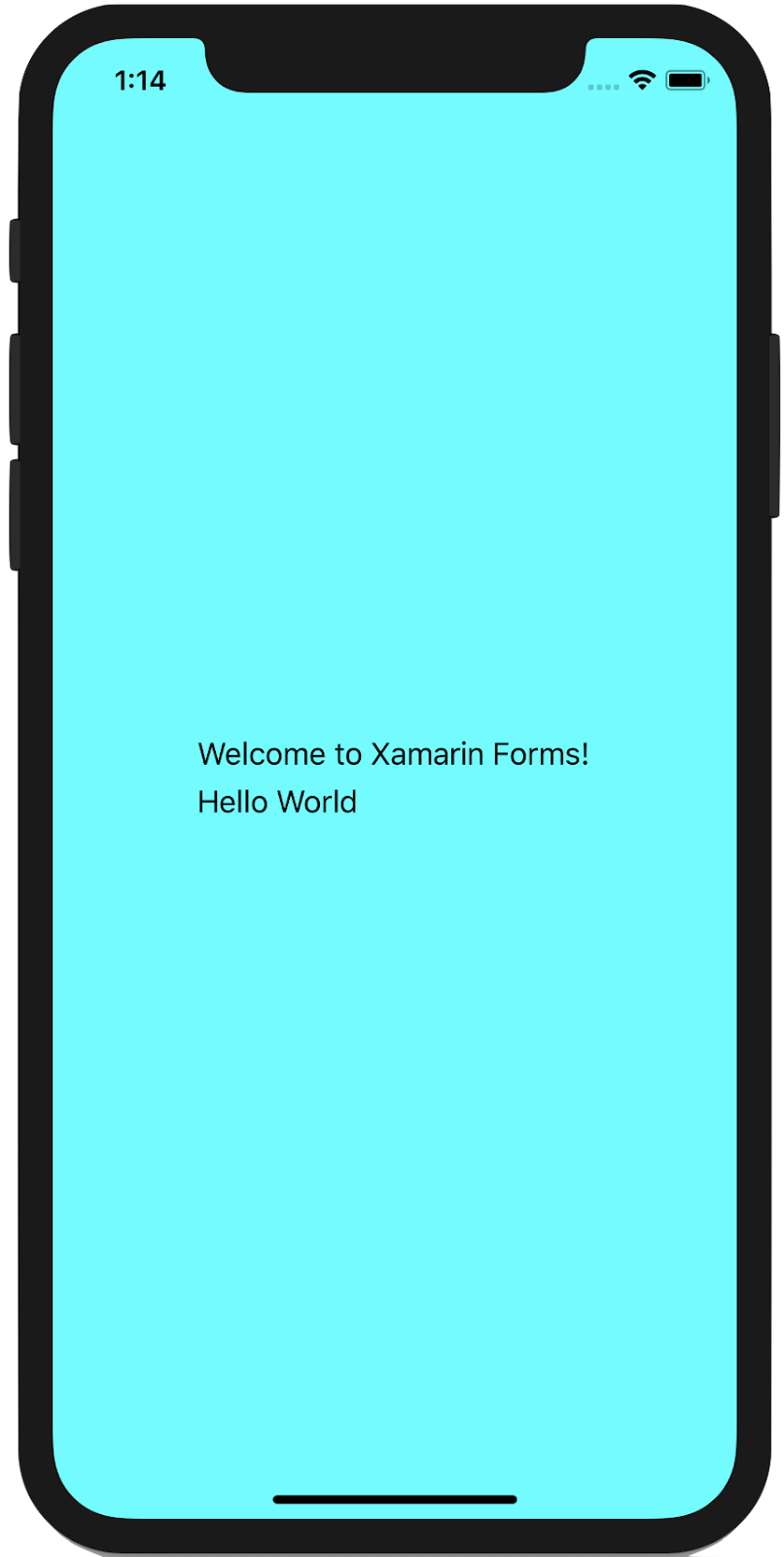
If you have any complex styling needs, you are almost always advised to have your styles defined in a separate CSS file - XAML visual tree definition and its styling can be pulled together at runtime. For very simple scenarios, however, you have the option of defining your CSS styles inline within your XAML file:
<ContentPage.Resources>
 <StyleSheet>
   <![CDATA[
     ^contentpage {
       background-color: aqua;
     }
   ]]>
 </StyleSheet>
</ContentPage.Resources>
XML
Here's how it looks at runtime:
Inheritance

Let's get to the cascading part of CSS styling. This is where CSS shines with easy "trickle-down" effects. Assume you want all Labels within a StackLayout to have a certain style. You can refer to direct children using the element>element selector.

Assume the following XAML:
<StackLayout x:Name="MyStack"
            Orientation="Vertical"
            VerticalOptions="Center"
            HorizontalOptions="Center">
 <Label Text="Welcome to Xamarin Forms!" StyleClass="MyLabel" />
 <Label x:Name="NamedLabel" Text="Hello World" />
</StackLayout>
XML
Let's style the direct children of the StackLayout using the element>element selector.

stacklayout>label {
 color: blue;
}
CSS
You can start to appreciate the power and flexibility that CSS support in Xamarin.Forms provide


Now, what if you want all child elements to have a specific style, even though they do not inherit from a direct parent? Simply use the element selector! Again, let's assume some XAML.

<StackLayout x:Name="MyStack"
            Orientation="Vertical"
            VerticalOptions="Center"
            HorizontalOptions="Center">
 <Label Text="Welcome to Xamarin Forms!" StyleClass="MyLabel" />
 <Label x:Name="NamedLabel" Text="Hello World" />
 <StackLayout Orientation="Vertical">
   <Button Text="Hi" />
 </StackLayout>
</StackLayout>
XML
Let's use the element selector to style the button

stacklayout button {
 background-color: wheat;
}
HAPPY XAM CODING  :) 

Friday, 15 June 2018

XF CheckBox

XF Checkbox
Hello guys,
I know that creating a beautiful app requires more attractive widgets or controls. If we want to make a beautiful app, we'll need enough widgets or controls. We know very well that xamarin does not have enough widgets, such as checkboxes,radio button groups etc.
So guys, I will tell you how to create the checkbox control in xamarin forms.


A checkbox is a selection box or a tick box. a checkbox is required on a form or window page, which is used to answering a question. Or you can use this to select the setting.
Let's start with...


Implementation

  • We need to go to PCL project and right click on the project.
  • Select Add then click on New items.
  • Here appears a dialog box, now here I am choosing content view and  then give name "Checkbox.xaml" then click ok.
  • Creating ”Checkbox.xaml” content view we design a view for a custom Checkbox. 


XAML CODE=> Checkbox.xaml:-

<Grid ColumnSpacing="5" HeightRequest="24">
<Grid.ColumnDefinitions>
<ColumnDefinition Width="Auto"/>
<ColumnDefinition Width="*"/>
</Grid.ColumnDefinitions>
<Image x:Name="MainImage" Grid.Column="0" Source="chk" HeightRequest="16" WidthRequest="16" Aspect="AspectFit"/>
<Label x:Name="MainLabel" Grid.Column="1" Text="{Binding Text,Mode=TwoWay}" FontSize="Small" TextColor="{Binding TextColor,Mode=TwoWay}"/>
</Grid>


Now, I am done with the design part. After it we will set the property of Text,
TextColor,and IsChecked Properties.
Here we write some coding blah blah …..... :)

C# Code Here :-
using System;
using System.Collections.Generic;
using System.Linq;
using System.Text;
using System.Threading.Tasks;
using Xamarin.Forms;
using Xamarin.Forms.Xaml;

namespace XamBuddyApp.CustomControls.CustomView
{
[XamlCompilation(XamlCompilationOptions.Compile)]
public partial class CheckBox : ContentView
{
public CheckBox()
{
InitializeComponent();
MainLabel.BindingContext = this;
IsChecked = false;
var tgr = new TapGestureRecognizer { NumberOfTapsRequired = 1 };
tgr.Tapped += ViewOn_Clicked;
this.GestureRecognizers.Add(tgr);
}

private void ViewOn_Clicked(object sender, EventArgs e)
{
Device.BeginInvokeOnMainThread(async () =>
{
if (check == true)
{
await Task.WhenAll(
MainImage.FadeTo(0, 100),
MainImage.ScaleTo(0, 100),
MainImage.TranslateTo(0, 0, 100, Easing.BounceIn)
);
MainImage.Source = "uncheck";
check = false;
await Task.WhenAll(
MainImage.FadeTo(1, 100),
MainImage.ScaleTo(1, 100),
MainImage.TranslateTo(0, 0, 100, Easing.BounceIn)
);
}
else
{
await Task.WhenAll(
MainImage.FadeTo(0, 100),
MainImage.ScaleTo(0, 100),
MainImage.TranslateTo(0, 0, 100, Easing.BounceIn)
);
MainImage.Source = "check";
check = true;
await Task.WhenAll(
MainImage.FadeTo(1, 100),
MainImage.ScaleTo(1, 100),
MainImage.TranslateTo(0, 0, 100, Easing.BounceIn)
);
}
});
}

public static BindableProperty TextProperty = BindableProperty.Create(nameof(Text),
typeof(string), typeof(CheckBox), defaultBindingMode: BindingMode.TwoWay);
public static BindableProperty TextColorProperty = BindableProperty.Create(nameof(TextColor),
typeof(Color), typeof(CheckBox), defaultBindingMode: BindingMode.TwoWay, defaultValue: Color.Black);
public static BindableProperty IsCheckedProperty = BindableProperty.Create(nameof(IsChecked),
typeof(bool), typeof(CheckBox),
defaultValue: false, propertyChanged: (bindable, oldVal, newVal) =>
{
var matChk = (CheckBox)bindable;
matChk.check = (bool)newVal;
if (matChk.IsChecked == true)
matChk.MainImage.Source = "check";
else
matChk.MainImage.Source = "uncheck";
});

private bool check = false;
public bool IsChecked
{
get
{
return check;
}
set
{
if (IsChecked == true)
{
MainImage.Source = "check";
}
else
{
MainImage.Source = "uncheck";
}
}
}

public string Text
{
get => (string)GetValue(TextProperty);
set => SetValue(TextProperty, value);
}

public Color TextColor
{
get => (Color)GetValue(TextColorProperty);
set => SetValue(TextColorProperty, value);
}
}
}


After XAML and C# Code…
Finally, we use CheckBox in Xamarin Forms

Here is the demo code for test CheckBox


<StackLayout BackgroundColor="#384E70" Padding="30" HorizontalOptions="CenterAndExpand" VerticalOptions="CenterAndExpand">
<chk:CheckBox x:Name="chk" IsChecked="False" Text="This is checkbox" TextColor="Red"/>
<Button x:Name="btntestchk" Text="Test Check Box" Style="{StaticResource buttonStyle}" Clicked="btntestchk_Clicked"/>
</StackLayout>


ButtonClick Code :-


private void btntestchk_Clicked(object sender, EventArgs e)
{
if (chk.IsChecked == true)
DisplayAlert("Info", "Check ", "OK");
else if (chk.IsChecked == false)
DisplayAlert("Info", " Uncheck ", "OK");
}


TADDAAAAA!!!!

Checkbox working fine.

Sunday, 27 May 2018

XF Floating Label


Hello Guys,
Today I want to tell you about the hack for floating labels. It is very important for designing purpose.

I know that many people are searching floating labels and I searched a lot and found that this is a hack. This is the reason why I'm going to show the way to create floating labels in xamarin forms, this is a very easy and interesting post.

You are ready to begin, so we start with a BorderlessEntry, and if you do not know about this, please read the BorderlessEntry Blog or Article and watch the Video, I have mentioned the URL below.


Okay, So we continue with this BorderlessEntry and now we are using BindableProperty and some animation code for the float the label.
Implementation:-
  • Go to the PCL project and right-click on the project.
  • Then, create a new folder which is named Custom View.
  •  In this folder, I have to create a content view, we need to do this, which is named "FloatingEntryView.xaml".
  • After creating "FloatingEntryView.xaml" we will prepare a view on "FloatingEntryView.xaml" for a custom floating label in Xamarin.Forms.
XAML CODE=> FloatingEntry.xaml


<ContentView.Content>
<Grid ColumnSpacing="16" Margin="0,8">
<Grid.RowDefinitions>
<RowDefinition Height="Auto"/>
<RowDefinition Height="1"/>
</Grid.RowDefinitions>
<Label x:Name="HiddenLabel" FontSize="10" IsVisible="False" Margin="25,15,25,10"/>
<local:CustomEntry x:Name="EntryField" Text="{Binding Text, Mode=TwoWay}" Margin="0,12,0,0"/>
<BoxView x:Name="BottomBorder" BackgroundColor="Gray" Grid.Row="1" HeightRequest="2" Margin="0" HorizontalOptions="FillAndExpand"/>
<BoxView x:Name="HiddenBottomBorder" BackgroundColor="Gray" Grid.Row="1" HeightRequest="2" Margin="0" WidthRequest="0" HorizontalOptions="Center"/>
</Grid>
</ContentView.Content>


Now we are set BorderlessEntry, hide label and the boxview in "FloatingEntryView.xaml" view. Well, I am satisfied this design part, now I'm going to write some code on "Focus" and "Focus" event and using animation to display the label when I touch any entry.

Here we set up BindableProperties on
AccentColor, Text, Text Color, Placeholder and Placeholder Color. Below I mentioned that the blah blah code ….. :)

C# Code FloatingEntry.cs


using System.Threading.Tasks;
using Xamarin.Forms;
using Xamarin.Forms.Xaml;

namespace XamBuddyApp.CustomControls.CustomView
{
[XamlCompilation(XamlCompilationOptions.Compile)]
public partial class FloatingEntry : ContentView
{
public FloatingEntry()
{
InitializeComponent();
EntryField.BindingContext= this;

EntryField.Focused+= async (s, a) =>
{

HiddenBottomBorder.BackgroundColor= AccentColor;
EntryField.TextColor= HiddenLabel.TextColor = AccentColor;
HiddenLabel.IsVisible= true;

if(string.IsNullOrEmpty(EntryField.Text))
{
//Here we give animation on label position, label fading and box view.
await Task.WhenAll(
HiddenBottomBorder.LayoutTo(new Rectangle(BottomBorder.X, BottomBorder.Y, BottomBorder.Width,BottomBorder.Height + 2), 200),
HiddenLabel.FadeTo(1,120),
HiddenLabel.TranslateTo(HiddenLabel.TranslationX- 25, EntryField.Y - EntryField.Height , 200, Easing.BounceIn)
);
EntryField.Placeholder= null;
}
else
{
await HiddenBottomBorder.LayoutTo(new Rectangle(BottomBorder.X, BottomBorder.Y,BottomBorder.Width, BottomBorder.Height), 200);
}
};
EntryField.Unfocused+= async (s, a) =>
{
if(string.IsNullOrEmpty(EntryField.Text))
{
await Task.WhenAll(
HiddenBottomBorder.LayoutTo(new Rectangle(BottomBorder.X, BottomBorder.Y, 0, BottomBorder.Height + 2), 200),
HiddenLabel.FadeTo(0,180),
HiddenLabel.TranslateTo(HiddenLabel.TranslationX+ 25, EntryField.Y, 50, Easing.BounceIn)
);
EntryField.Placeholder= Placeholder;
}
else
{
await HiddenBottomBorder.LayoutTo(new Rectangle(BottomBorder.X, BottomBorder.Y, 0,BottomBorder.Height), 100);
}
};
}

public static BindableProperty TextProperty = BindableProperty.Create(nameof(Text),typeof(string), typeof(FloatingEntry), defaultBindingMode: BindingMode.TwoWay);

public static BindableProperty PlaceholderProperty =BindableProperty.Create(nameof(Placeholder),typeof(string),typeof(FloatingEntry), defaultBindingMode:BindingMode.TwoWay,
propertyChanged:(bindable, oldVal, newval) =>
{
var matEntry = (FloatingEntry)bindable;
matEntry.EntryField.Placeholder= (string)newval;
matEntry.HiddenLabel.Text= (string)newval;
});

public static BindableProperty IsPasswordProperty =BindableProperty.Create(nameof(IsPassword), typeof(bool),typeof(FloatingEntry), defaultValue: false, 
propertyChanged: (bindable, oldVal,newVal) =>
{
var matEntry = (FloatingEntry)bindable;
matEntry.EntryField.IsPassword= (bool)newVal;
});

public static BindableProperty KeyboardProperty =BindableProperty.Create(nameof(Keyboard), typeof(Keyboard),typeof(FloatingEntry), defaultValue: Keyboard.Default, 
propertyChanged:(bindable, oldVal, newVal) =>
{
var matEntry = (FloatingEntry)bindable;
matEntry.EntryField.Keyboard= (Keyboard)newVal;
});

public static BindableProperty AccentColorProperty =BindableProperty.Create(nameof(AccentColor),typeof(Color),typeof(FloatingEntry),defaultValue:Color.Accent);

public Color AccentColor 
{
get=>(Color)GetValue(AccentColorProperty);
set=> SetValue(AccentColorProperty, value);
}

public Keyboard Keyboard
{
get=>(Keyboard)GetValue(KeyboardProperty);
set=> SetValue(KeyboardProperty, value);
}

public bool IsPassword
{
get=>(bool)GetValue(IsPasswordProperty);
set=> SetValue(IsPasswordProperty, value);
}

public string Text
{
get=>(string)GetValue(TextProperty);
set=> SetValue(TextProperty, value);
}

public string Placeholder
{
get=>(string)GetValue(PlaceholderProperty);
set=> SetValue(PlaceholderProperty, value);
}
}
}


In the code, we giving some animation effects so that the effect of the float can be seen as the original widget of Android.
Finally, Code is Complete,
Here I am creating a login form on the MainPage.xml so I will be showing the effect of the floating label. 
So let's see floating label does works properly like an android widget?

 XAML CODE=> MainPage.xaml


<ContentPage.Content>
        <Grid Padding="35"  BackgroundColor="#9688EE">
            <Grid.RowDefinitions>
                <RowDefinition Height="Auto"/>
                <RowDefinition Height="Auto"/>
                <RowDefinition Height="Auto"/>
                <RowDefinition Height="Auto"/>
                <RowDefinition Height="*"/>
            </Grid.RowDefinitions>
            <StackLayout HorizontalOptions="CenterAndExpand" Grid.Row="0" Grid.Column="0">
                <Label Text="Wonder" TextColor="White" FontSize="32" FontAttributes="Bold" HorizontalOptions="Center"/>
                <Label Text="UI Design By Xamarin Buddy" TextColor="White" Font="18,Bold"/>
                <StackLayout Spacing="0" Orientation="Horizontal" HorizontalOptions="CenterAndExpand" >
                    <Label Text="Facebook" TextColor="White"/>
                    <Label Text="Twitter" TextColor="White"/>
                </StackLayout>
            </StackLayout>
            <cv:FloatingEntry Placeholder="Email" AccentColor="White" Grid.Row="1" Grid.Column="0" />
            <cv:FloatingEntry Placeholder="Password" IsPassword="True" AccentColor="White" Grid.Row="2" Grid.Column="0"/>
            <Label Text="Forgot Password?" TextColor="White" Grid.Row="3" Grid.Column="0" Margin="0,-15,0,0"/>
            <StackLayout Spacing="25" Padding="10" Grid.Row="4" Grid.Column="0" VerticalOptions="EndAndExpand">
                <Button Text="Login"  BackgroundColor="White" TextColor="#9688EE" BorderRadius="5" HeightRequest="45"
                    BorderWidth="3" BorderColor="Gray"/>
                <Label Text="Register Now" HorizontalOptions="CenterAndExpand"  TextColor="White" />
            </StackLayout>
        </Grid>
    </ContentPage.Content>


TADDDAAAAA!!!!!!!!!!!!!!!!!!!


XF FloatingLabel is working successfully.

Featured Post

Sliding Entry In Xamarin.Forms

  Today, I am going to show you how to create a Custom Slide entry in Xamarin.Forms with animation and also using gradient color. here is Y...