Hello My Xamarin Friends,
This is my new post in which I am going to tell you how to customize the Entry.
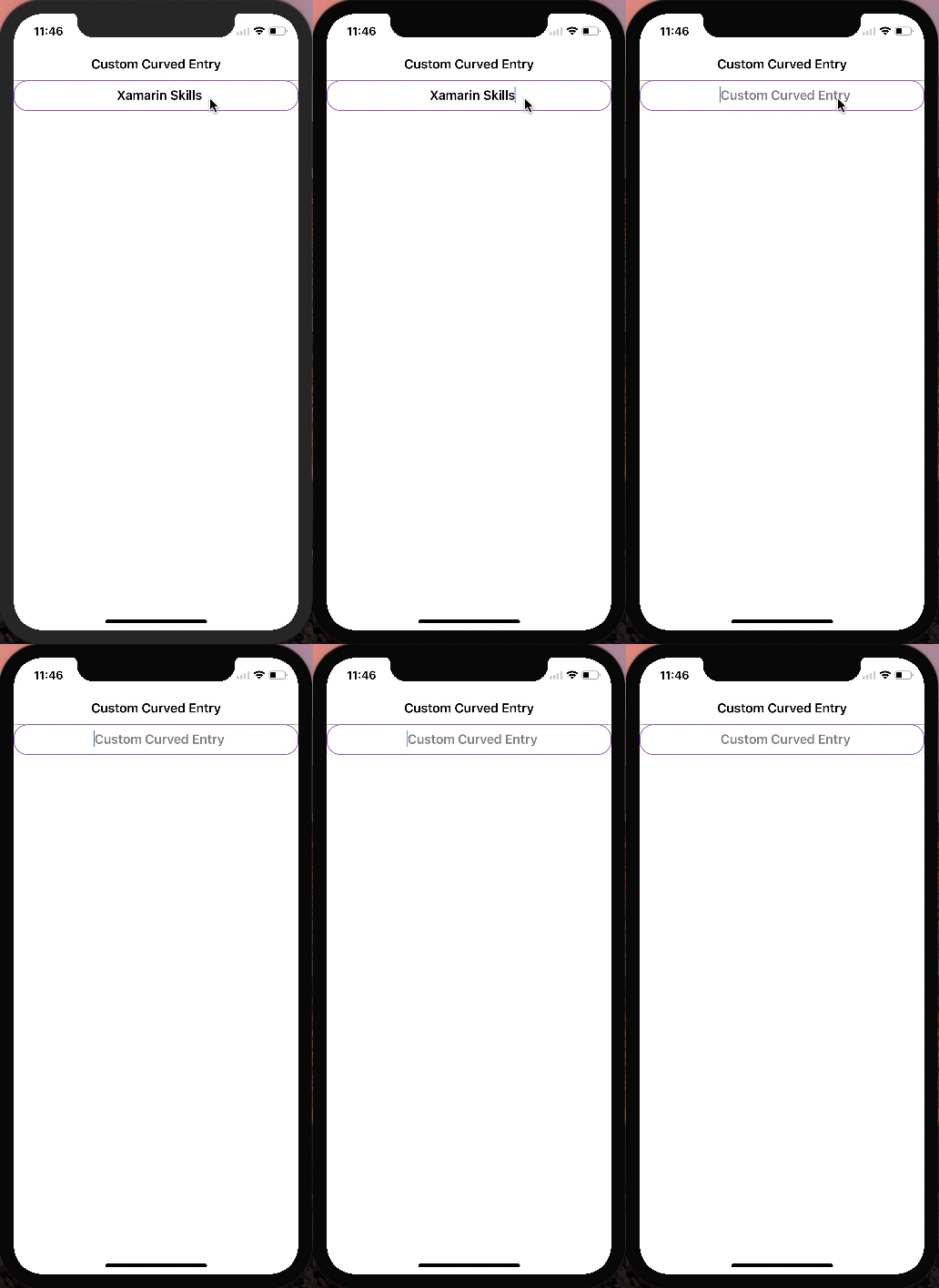
Entry is a rectangular input frame control in which we can give any type of text input and in this post, we are going to discuss custom entry, this entry will make curved Corner entry.
Let's start........

First, we will create a class whose name is "CustomEntry" and then we will write a code in "C #".
Now, we will write some code in android project to set the Border Color, Width, Radius and Background Color, IsCurvedCornersEnabled ....
Please make sure to dependency reference.....
[assembly: ExportRenderer(typeof(CustomLabel), typeof(CurvedLabelRenderer))]
Then we create an Ios Project Also
Please make sure to add view reference.....
xmlns:local="clr-namespace:CustomEntryApp"
then write xaml code in main page.
TADDAAAA!

Now, you will have your CustomEntry working!!
Public Property Entry controls
This is my new post in which I am going to tell you how to customize the Entry.
Entry is a rectangular input frame control in which we can give any type of text input and in this post, we are going to discuss custom entry, this entry will make curved Corner entry.
Let's start........
First, we will create a class whose name is "CustomEntry" and then we will write a code in "C #".
Now, we will write some code in android project to set the Border Color, Width, Radius and Background Color, IsCurvedCornersEnabled ....
Please make sure to dependency reference.....
[assembly: ExportRenderer(typeof(CustomLabel), typeof(CurvedLabelRenderer))]
Then we create an Ios Project Also
Please make sure to add view reference.....
xmlns:local="clr-namespace:CustomEntryApp"
then write xaml code in main page.
TADDAAAA!

Now, you will have your CustomEntry working!!
Public Property Entry controls
- FontAttributes FontAttributes=(FontAttributes="Bold")
- FontSize Double=(FontSize="Default")
- IsPassword Boolean=(IsPassword="True")
- Placeholder String=( Placeholder="Xamarin Buddy")
- Text String (Text="Xamarin Buddy")
- PlaceholderColor Color=( PlaceholderColor="Red")
- TextColor Color=(TextColor="DarkBlue")
- FontFamily String=(FontFamily="")
- HorizontalTextAlignment TextAlignment=(HorizontalTextAlignment="Start")
Features of CustomEntry controls
- Custom Border Color Property=(CustomBorderColor="#24C4FF")
- Custom Background Color Property=(CustomBackgroundColor="#24C4FF")
- Custom Border Radius Property=(CustomBorderRadius="4")
- Custom Border Width Property=(CustomBorderWidth="4")
- Custom IsCurvedCornersEnabled =(IsCurvedCornersEnabled ="True")
To get full source code Click Here
To watch video Click Here